Dealing with the day-to-day of inventory management can keep you busy. There’s the usual rhythm of ordering, receiving, forecasting and planning, and moving things around in the warehouse. Then there are the frenetic times – shortages, expedites, last-minute calls to find new suppliers.
All this activity works against taking a moment to see how you’re doing. But you know you have to get your head up now and then to see where you’re heading. For that, your inventory software should show you metrics – and not just one, but a full set of metrics or KPI’s – Key Performance Indicators.
Multiple Metrics
Depending on your role in your organization, different metrics will have different salience. If you are on the finance side of the house, inventory investment may be top of mind: how much cash is tied up in inventory? If you’re on the sales side, item availability may be top of mind: what’s the chance that I can say “yes” to an order? If you’re responsible for replenishment, how many PO’s will your people have to cut in the next quarter?
Availability Metrics
Let’s circle back to item availability. How do you put a number on that? The two most used availability metrics are “service level” and “fill rate.” What’s the difference? It’s the difference between saying “We had an earthquake yesterday” and saying, “We had an earthquake yesterday, and it was a 6.4 on the Richter scale.” Service level records the frequency of stockouts no matter their size; fill rate reflects their severity. The two can seem to point in opposite directions, which causes some confusion. You can have a good service level, say 90%, but have an embarrassing fill rate, say 50%. Or vice versa. What makes them different is the distribution of demand sizes. For instance, if the distribution is very skewed, so most demands are small but some are huge, you might get the 90%/50% split mentioned above. If your focus is on how often you have to backorder, service level is more relevant. If your worry is how big an overnight expedite can get, the fill rate is more relevant.
One Graph to Rule them All
A graph of on-hand inventory can provide the basis for calculating multiple KPI’s. Consider Figure 1, which plots on-hand each day for a year. This plot has information needed to calculate multiple metrics: inventory investment, service level, fill rate, reorder rate and other metrics.
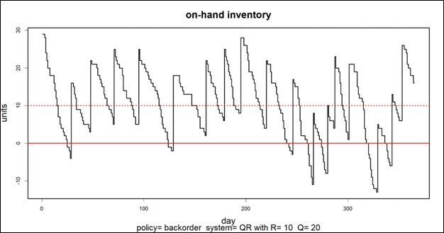
Inventory investment: The average height of the graph when above zero, when multiplied by unit cost of the inventory item, gives quarterly dollar value.
Service level: The fraction of inventory cycles that end above zero is the service level. Inventory cycles are marked by the up movements occasioned by the arrival of replenishment orders.
Fill rate: The amount by which inventory drops below zero and how long it stays there combine to determine fill rate.
In this case, the average number of units on hand was 10.74, the service level was 54%, and the fill rate was 91%.
KPI’s and KPP’s
In the over forty years since we founded Smart Software, I have never seen a customer produce a plot like Figure 1. Those who are further along in their development do produce and pay attention to reports listing their KPI’s in tabular form, but they don’t look at such a graph. Nevertheless, that graph has value for developing insight into the random rhythms of inventory as it rises and falls.
Where it is especially useful is prospectively. Given market volatility, key variables like supplier lead times, average demand, and demand variability all shift over time. This implies that key control parameters like reorder points and order quantities must adjust to these shifts. For instance, if a supplier says they’ll have to increase their average lead time by 2 days, this will impact your metrics negatively, and you may need to increase your reorder point to compensate. But increase it by how much?
Here is where modern inventory software comes in. It will let you propose an adjustment and then see how things will play out. Plots like Figure 1 let you see and get a feel for the new regime. And the plots can be analyzed to compute KPP’s – Key Performance Predictions.
KPP’s help take the guesswork out of adjustments. You can simulate what will happen to your KPI’s if you change them in response to changes in your operating environment – and how bad things will get if you make no changes.