Direct to the Brain of the Boss – Inventory Analytics and Reporting

I’ll start with a confession: I’m an algorithm guy. My heart lives in the “engine room” of our software, where lightning-fast calculations zip back and forth across the AWS cloud, generating demand and supply scenarios used to guide important decisions about demand forecasting and inventory management.

But I recognize that the target of all that beautiful, furious calculation is the brain of the boss, the person responsible for making sure that customer demand is satisfied in the most efficient and profitable way. So, this blog is about Smart Operational Analytics (SOA), which creates reports for management. Or, as they are called in the military, sit-reps.

All the calculations guided by the planners using our software ultimately get distilled into the SOA reports for management. The reports focus on five areas: inventory analysis, inventory performance, inventory trending, supplier performance, and demand anomalies.

Inventory Analysis

These reports keep tabs on current inventory levels and identify areas that need improvement. The focus is on current inventory counts and their status (on hand, in transit, in quarantine), inventory turns, and excesses vs shortages.

Inventory Performance

These reports track Key Performance Indicators (KPIs) such as Fill Rates, Service Levels, and inventory Costs. The analytic calculations elsewhere in the software guide you toward achieving your KPI targets by calculating Key Performance Predictions (KPPs) based on recommended settings for, e.g., reorder points and order quantities. But sometimes surprises occur, or operating policies are not executed as recommended, so there will always be some slippage between KPPs and KPIs.

Inventory Trending

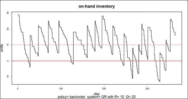
Knowing where things stand today is important, but seeing where things are trending is also valuable. These reports reveal trends in item demand, stockout events, average days on hand, average time to ship, and more.

Supplier Performance

Your company cannot perform at its best if your suppliers are dragging you down. These reports monitor supplier performance in terms of the accuracy and promptness of filling replenishment orders. Where you have multiple suppliers for the same item, they let you compare them.

Demand Anomalies

Your entire inventory system is demand driven, and all inventory control parameters are computed after modeling item demand. So if something odd is happening on the demand side, you must be vigilant and prepare to recalculate things like mins and maxes for items that are starting to act in odd ways.

Summary

The end point for all the massive calculations in our software is the dashboard showing management what’s going on, what’s next, and where to focus attention. Smart Inventory Analytics is the part of our software ecosystem aimed at your company’s C-Suite.

 Smart Reporting Studio Inventory Management Supply Software

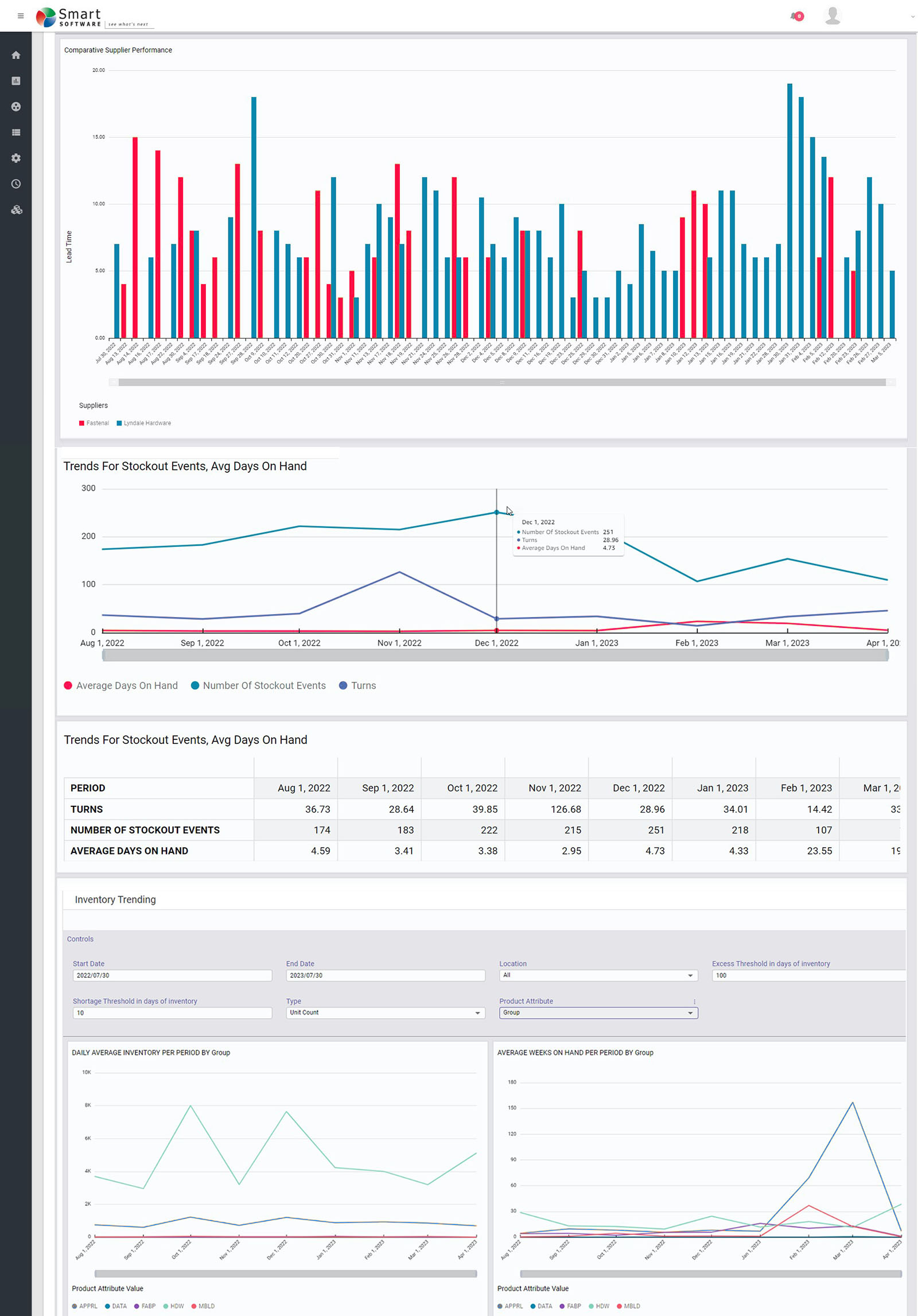
Figure 1: Some sample reports in graphical form


How Are We Doing? KPI’s and KPP’s

Dealing with the day-to-day of inventory management can keep you busy. There’s the usual rhythm of ordering, receiving, forecasting and planning, and moving things around in the warehouse. Then there are the frenetic times – shortages, expedites, last-minute calls to find new suppliers.

All this activity works against taking a moment to see how you’re doing. But you know you have to get your head up now and then to see where you’re heading. For that, your inventory software should show you metrics – and not just one, but a full set of metrics or KPI’s – Key Performance Indicators.

Multiple Metrics

Depending on your role in your organization, different metrics will have different salience. If you are on the finance side of the house, inventory investment may be top of mind: how much cash is tied up in inventory? If you’re on the sales side, item availability may be top of mind: what’s the chance that I can say “yes” to an order? If you’re responsible for replenishment, how many PO’s will your people have to cut in the next quarter?

Availability Metrics

Let’s circle back to item availability. How do you put a number on that? The two most used availability metrics are “service level” and “fill rate.” What’s the difference? It’s the difference between saying “We had an earthquake yesterday” and saying, “We had an earthquake yesterday, and it was a 6.4 on the Richter scale.” Service level records the frequency of stockouts no matter their size; fill rate reflects their severity. The two can seem to point in opposite directions, which causes some confusion. You can have a good service level, say 90%, but have an embarrassing fill rate, say 50%. Or vice versa. What makes them different is the distribution of demand sizes. For instance, if the distribution is very skewed, so most demands are small but some are huge, you might get the 90%/50% split mentioned above. If your focus is on how often you have to backorder, service level is more relevant. If your worry is how big an overnight expedite can get, the fill rate is more relevant.

One Graph to Rule them All

A graph of on-hand inventory can provide the basis for calculating multiple KPI’s. Consider Figure 1, which plots on-hand each day for a year. This plot has information needed to calculate multiple metrics: inventory investment, service level, fill rate, reorder rate and other metrics.

Key performace indicators and paramenters for inventory management

Inventory investment: The average height of the graph when above zero, when multiplied by unit cost of the inventory item, gives quarterly dollar value.

Service level: The fraction of inventory cycles that end above zero is the service level. Inventory cycles are marked by the up movements occasioned by the arrival of replenishment orders.

Fill rate: The amount by which inventory drops below zero and how long it stays there combine to determine fill rate.

In this case, the average number of units on hand was 10.74, the service level was 54%, and the fill rate was 91%.


KPI’s and KPP’s

In the over forty years since we founded Smart Software, I have never seen a customer produce a plot like Figure 1.  Those who are further along in their development do produce and pay attention to reports listing their KPI’s in tabular form, but they don’t look at such a graph. Nevertheless, that graph has value for developing insight into the random rhythms of inventory as it rises and falls.

Where it is especially useful is prospectively. Given market volatility, key variables like supplier lead times, average demand, and demand variability all shift over time. This implies that key control parameters like reorder points and order quantities must adjust to these shifts. For instance, if a supplier says they’ll have to increase their average lead time by 2 days, this will impact your metrics negatively, and you may need to increase your reorder point to compensate. But increase it by how much?

Here is where modern inventory software comes in. It will let you propose an adjustment and then see how things will play out. Plots like Figure 1 let you see and get a feel for the new regime. And the plots can be analyzed to compute KPP’s – Key Performance Predictions.

KPP’s help take the guesswork out of adjustments. You can simulate what will happen to your KPI’s if you change them in response to changes in your operating environment – and how bad things will get if you make no changes.


Top 4 Moves When You Suspect Software is Inflating Inventory

We often are asked, “Why is the software driving up the inventory?” The answer is that Smart isn’t driving it in either direction – the inputs are driving it, and those inputs are controlled by the users (or admins). Here are four things you can do to get the results you expect.

1. Confirm that your service level targets are commensurate with what you want for that item or group of items. Setting very high targets (95% or more) will likely drive inventory up if you have been coasting along at a lower level and are OK with being there. It’s possible you’ve never achieved the new higher service level but customers have not complained.  Figure out what service level has worked by evaluating historical reports on performance and set your targets accordingly. But keep in mind that competitors may beat you on item availability if you keep using your father’s service level targets.

2. Make sure your understanding of “service level” aligns with the software system’s definition. You may be measuring performance based on how often you ship within one week from receipt of the customer order, whereas the software is targeting reorder points based on your ability to ship right away, not within a week. Clearly the latter will require more inventory to hit the same “service level.” For instance, a 75% same-day service level may correspond to a 90% same-week service level. In this case, you are really comparing apples to oranges. If this is the reason for the excess stock, then determine what “same day” service level is needed to get you to your desired “same week” service level and enter that into the software. Using the less-stringent same-day target will drop the inventory, sometimes very significantly.

3. Evaluate the lead time inputs. We’ve seen instances in which lead times had been inflated to trick old software into producing desired results. Modern software tracks suppliers’ performance by recording their actual lead times over multiple orders, then it takes account of lead time variability in its simulations of daily operations. Watch out if your lead times are fixed at one value that was decided on in the distant past and isn’t current.

4. Check your demand signal. You have lots of historical transactions in your ERP system that can be used in many ways to determine the demand history. If you are using signals such as transfers, or you are not excluding returns, then you may be overstating demand. Spend a little time on defining “demand” in the way that makes most sense for your situation.

What makes a probabilistic forecast?

What’s all the hoopla around the term “probabilistic forecasting?” Is it just a more recent marketing term some software vendors and consultants have coined to feign innovation? Is there any real tangible difference compared to predecessor “best fit” techniques?  Aren’t all forecasts probabilistic anyway?

To answer this question, it is helpful to think about what the forecast really is telling you in terms of probabilities.  A “good” forecast should be unbiased and therefore yield a 50/50 probability being higher or lower than the actual.  A “bad” forecast will build in subjective buffers (or artificially depress the forecast) and result in demand that is either biased high or low.  Consider a salesperson that intentionally reduces their forecast by not reporting sales they expect to close to be “conservative.” Their forecasts will have negative forecast bias as actuals will nearly always be higher than what they predicted.   On the other hand, consider a customer that provides an inflated forecast to their manufacturer.  Worried about stockouts, they overestimate demand to ensure their supply.  Their forecast will have a positive bias as actuals will nearly always be lower than what they predicted. 

These types of one-number forecasts described above are problematic.  We refer to these predictions as “point forecasts” since they represent one point (or a series of points over time) on a plot of what might happen in the future.   They don’t provide a complete picture because to make effective business decisions such as determining how much inventory to stock or the number of employees to be available to support demand requires detailed information on how much lower or higher the actual will be!  In other words, you need the probabilities for each possible outcome that might occur.  So, by itself, the point forecast isn’t probabilistic one.   

To get a probabilistic forecast, you need to know the distribution of possible demands around that forecast.  Once you compute this, the forecast becomes “probabilistic.”  How forecasting systems and practitioners such as demand planners, inventory analysts, material managers, and CFOs determine these probabilities is the heart of the question: “what makes a forecast probabilistic?”     

Normal Distributions
Most forecasts and the systems/software that produce them start with a prediction of demand.  Then they figure out the range of possible demands around that forecast by making incorrect theoretical assumptions about the distribution.  If you’ve ever used a “confidence interval” in your forecasting software, this is based on a probability distribution around the forecast.  The way this range of demand is determined is to assume a particular type of distribution.  Most often this means assuming a bell shaped, otherwise known as a normal distribution.  When demand is intermittent, some inventory optimization and demand forecasting systems may assume the demand is Poisson shaped. 

After creating the forecast, the assumed distribution is slapped around the demand forecast and you then have your estimate of probabilities for every possible demand – i.e., a “probabilistic forecast.”  These estimates of demand and associated probabilities can then be used to determine extreme values or anything in between if desired.  The extreme values at the upper percentiles of the distribution (i.e., 92%, 95%, 99%, etc.) are most often used as inputs to inventory control models.  For example, reorder points for critical spare parts in an electrical utility might be planned based on a 99.5% service level or even higher.  While a non-critical service part might be planned at an 85% or 90% service level.

The problem with making assumptions about the distribution is that you’ll get these probabilities wrong.  For example, if the demand isn’t normally distributed but you are forcing a bell shaped/normal curve on the forecast then how can then the probabilities will be incorrect.  Specifically, you might want to know the level of inventory needed to achieve a 99% probability of not running out of stock and the normal distribution will tell you to stock 200 units.  But when compared to the actual demand, you come to find out that 200 units only filled demand entirely in 40/50 observations.  So, instead of getting a 99% service level you only achieved an 80% service level!  This is a gigantic miss resulting from trying to fit a square peg into a round hole.  The miss would have led you to take an incorrect inventory reduction.

Empirically Estimated Distributions are Smart
To produce a smart (read accurate) probabilistic forecast you need to first estimate the distribution of demand empirically without any naïve assumptions about the shape of the distribution.  Smart Software does this by running tens of thousands of simulated demand and lead time scenarios.  Our solution leverages patented techniques that incorporate Monte Carlo simulation, Statistical Bootstrapping, and other methods.  The scenarios are designed to simulate real life uncertainty and randomness of both demand and lead times.  Actual historical observations are utilized as the primary inputs, but the solution will give you the option of simulating from non-observed values as well.  For example, just because 100 units was the peak historical demand, that doesn’t mean you are guaranteed to peak out at 100 in the future.  After the scenarios are done you will know the exact probability for each outcome. The “point” forecast then becomes the center of that distribution.  Each future period over time is expressed in terms of the probability distribution associated with that period.

Leaders in Probabilistic Forecasting
Smart Software, Inc. was the first company to ever introduce statistical bootstrapping as part of a commercially available demand forecasting software system twenty years ago.  We were awarded a US patent at the time for it and named a finalist in the APICS Corporate Awards of Excellence for Technological Innovation.  Our NSF Sponsored research that led to this and other discoveries were instrumental in advancing forecasting and inventory optimization.    We are committed to ongoing innovation, and you can find further information about our most recent patent here.


Correlation vs Causation: Is This Relevant to Your Job?

Outside of work, you may have heard the famous dictum “Correlation is not causation.” It may sound like a piece of theoretical fluff that, though involved in a recent Noble Prize in economics, isn’t relevant to your work as a demand planner. Is so, you may be only partially correct.

Extrapolative vs Causal Models

Most demand forecasting uses extrapolative models. Also called time-series models, these forecast demand using only the past values of an item’s demand. Plots of past values reveal trend and seasonality and volatility, so there is a lot they are good for. But there is another type of model – causal models —that can potentially improve forecast accuracy beyond what you can get from extrapolative models.

Causal models bring more input data to the forecasting task: information on presumed forecast “drivers” external to the demand history of an item. Examples of potentially useful causal factors include macroeconomic variables like the inflation rate, the rate of GDP growth, and raw material prices. Examples not tied to the national economy include industry-specific growth rates and your own and competitors’ ad spending.  These variables are usually used as inputs to regression models, which are equations with demand as an output and causal variables as inputs.

Forecasting using Causal Models

Many firms have an S&OP process that involves a monthly review of statistical (extrapolative) forecasts in which management adjusts forecasts based on their judgement. Often this is an indirect and subjective way to work causal models into the process without doing the regression modeling.

To actually make a causal regression model, first you have to nominate a list of potentially-useful causal predictor variables. These may come from your subject matter expertise. For example, suppose you manufacture window glass. Much of your glass may end up in new homes and new office buildings. So, the number of new homes and offices being built are plausible predictor variables in a regression equation.

There is a complication here: if you are using the equation to predict something, you must first predict the predictors. For example, sales of glass next quarter may be strongly related to numbers of new homes and new office buildings next quarter. But how many new homes will there be next quarter? That’s its own forecasting problem. So, you have a potentially powerful forecasting model, but you have extra work to do to make it usable.

There is one way to simplify things: if the predictor variables are “lagged” versions of themselves. For example, the number of new building permits issued six months ago may be a good predictor of glass sales next month. You don’t have to predict the building permit data – you just have to look it up.

Is it a causal relationship or just a spurious correlation?

Causal models are the real deal: there is an actual mechanism that relates the predictor variable to the predicted variable. The example of predicting glass sales from building permits is an example.

A correlation relationship is more iffy. There is a statistical association that may or may not provide a solid basis for forecasting. For example, suppose you sell a product that happens to appeal most strongly to Dutch people but you don’t realize this. The Dutch are, on average, the tallest people in Europe. If your sales are increasing and the average height of Europeans is increasing, you might use that relationship to good effect. However, if the proportion of Dutch in the Euro zone is decreasing while the average height is increasing because the mix of men versus women is shifting toward men, what can go wrong? You will expect sales to increase because average height is increasing. But your sales are really mostly to the Dutch, and their relative share of the population is shrinking, so your sales are really going to decrease instead. In this case the association between sales and customer height is a spurious correlation.

How can you tell the difference between true and spurious relationships? The gold standard is to do a rigorous scientific experiment. But you are not likely to be in position to do that. Instead, you have to rely on your personal “mental model” of how your market works. If your hunches are right, then your potential causal models will correlate with demand and causal modeling will pay off for you, either to supplement extrapolative models or to replace them.