Balancing Act
Managing inventory, like managing anything, involves balancing competing priorities. Do you want a lean inventory? Yes! Do you want to be able to say “It’s in stock” when a customer wants to buy something? Yes!
But can you have it both ways? Only to a degree. If you lean into leaning your inventory too aggressively, you risk stockouts. If you stamp out stockouts, you create inventory bloat. You are forced to find a satisfactory balance between the two competing goals of lean inventory and high item availability.
Striking a Balance
How do you strike that balance? Too many inventory planners “guestimate” their way to some kind of answer. Or they work out a smart answer once and hope that it has a distant sell-by date and keep using it while they focus on other problems. Unfortunately, shifts in demand and/or changes in supplier performance and/or shifts in your own company’s priorities will obsolete old inventory plans and put you right back where you started.
It is inevitable that every plan has a shelf life and has to be updated. However, it is definitely not best practice to replace one guess with another. Instead, each planning cycle should exploit modern supply chain software to replace guesswork with fact-based analysis using probability math.
Know Thyself
The one thing that software cannot do is compute a best answer without knowing your priorities. How much do you prioritize lean inventory over item availability? Software will predict the levels of inventory and availability caused by any decisions you make about how to manage each item in your inventory, but only you can decide whether any given set of key performance indicators is consistent with what you want.
Knowing what you want in a general sense is easy: you want it all. But knowing what you prefer when comparing specific scenarios is more difficult. It helps to be able to see a range of realizable possibilities and mull over which seems best when they are laid out side by side.
See What’s Next
Supply chain software can give you a view of the tradeoff curve. You know in general that lean inventory and high item availability trade off against each other, but seeing item-specific tradeoff curves sharpens your focus.
Why is there a curve? Because you have choices about how to manage each item. For instance, if you check inventory status continuously, what values will you assign to the Min and Max values that govern when to order replenishments and how much to order. The tradeoff curve arises because choosing different Min and Max values leads to different levels of on hand inventory and different levels of item availability, e.g., as measured by fill rate.
A Scenario for Analysis
To illustrate these ideas, I used a digital twin to estimate how various values of Min and Max would perform in a particular scenario. The scenario focused on a notional spare part with purely random demand having a moderately high level of intermittency (37% of days having zero demand). Replenishment lead times were a coin flip between 7 and 14 days. The Min and Max values were systematically varied: Min from 20 to 40 units, Max from Min+1 units to 2xMin units. Each (Min,Max) pair was simulated for 365 days of operation a total of 1,000 times, then the results averaged to estimate both the average number of on hand units and the fill rate, i.e., percentage of daily demands that were satisfied immediately from stock. If stock was not available, it was backordered.
Results
The experiment produced two types of results:
- Plots showing the relationship between Min and Max values and two key performance indicators: Fill rate and average units on hand.
- A tradeoff curve showing how the fill rate and units on hand trade off against each other.
Figure 1 plots on hand inventory as a function of the values of Min and Max. The experiment yielded on hand levels ranging from near 0 to about 40 units. In general, keeping Min constant and increasing Max results in more units on hand. The relationship with Min is more complex: keeping Max constant, increasing Min first adds to inventory but at some point reduces it.
Figure 2 plots fill rate as a function of the values of Min and Max. The experiment yielded fill rate levels ranging from near 0% to 100%. In general, the functional relationships between the fill rate and the values of Min and Max mirrored those in Figure1.
Figure 3 makes the key point, showing how varying Min and Max produces a perverse pairing of the key performance indicators. Generally speaking, the values of Min and Max that maximize item availability (fill rate) are the same values that maximize inventory cost (average units on hand). This general pattern is represented by the blue curve. The experiments also produced some offshoots from the blue curve that are associated with poor choices of Min and Max, in the sense that other choices dominate them by producing the same fill rate with lower inventory.
Conclusions
Figure 3 makes clear that your choice of how to manage an inventory item forces you to trade off inventory cost and item availability. You can avoid some inefficient combinations of Min and Max values, but you cannot escape the tradeoff.
The good side of this reality is that you do not have to guess what will happen if you change your current values of Min and Max to something else. The software will tell you what that move will buy you and what it will cost you. You can take off your Guestimator hat and do your thing with confidence.
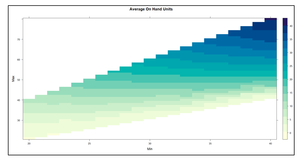
Figure 1 On Hand Inventory as a function of Min and Max values
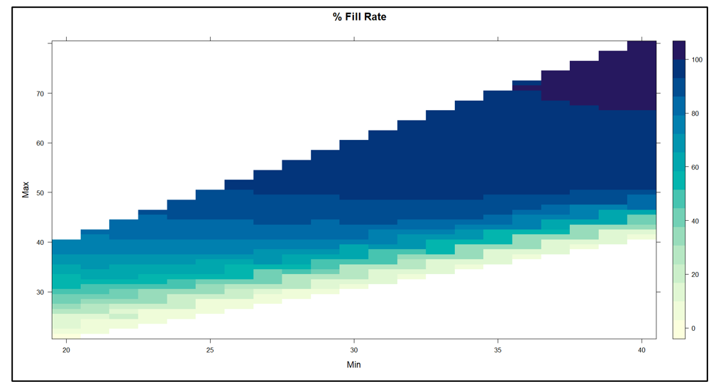
Figure 2 Fill Rate as a function of Min and Max values
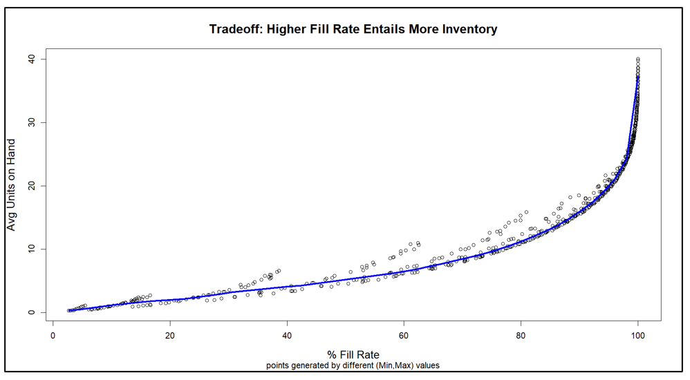
Figure 3 Tradeoff curve between Fill Rate and On Hand Inventory