Three Ways to Estimate Forecast Accuracy

Forecast accuracy is a key metric by which to judge the quality of your demand planning process. (It’s not the only one. Others include timeliness and cost; See 5 Demand Planning Tips for Calculating Forecast Uncertainty.) Once you have forecasts, there are a number of ways to summarize their accuracy, usually designated by obscure three- or four-letter acronyms like MAPE, RMSE, and MAE.  See Four Useful Ways to Measure Forecast Error for more detail.

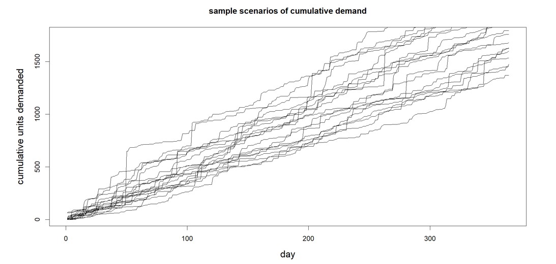
A less discussed but more fundamental issue is how computational experiments are organized for computing forecast error. This post compares the three most important experimental designs. One of them is old-school and essentially amounts to cheating. Another is the gold standard. A third is a useful expedient that mimics the gold standard and is best thought of as predicting how the gold standard will turn out. Figure 1 is a schematic view of the three methods.


Three Ways to Estimate Forecast Accuracy Software Smart

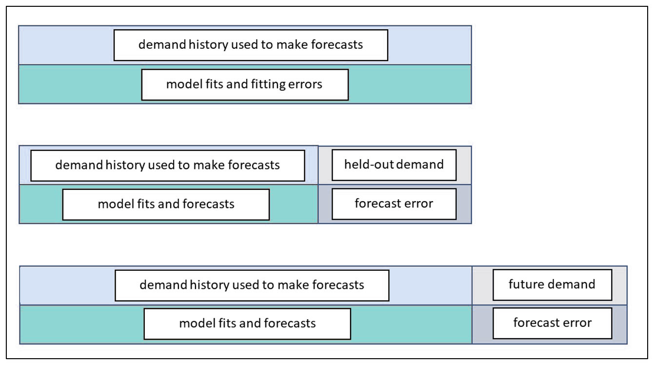
Figure 1: Three ways to assess forecast error


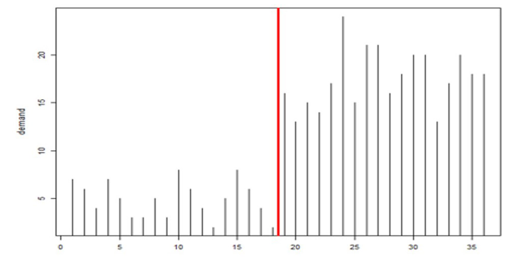
The top panel of Figure 1 depicts the way forecast error was assessed back in the early 1980’s before we moved the state of the art to the scheme shown in the middle panel. In the old days, forecasts were assessed on the same data used to compute the forecasts. After a model was fit to the data, the errors computed were not for model forecasts but for model fits. The difference is that forecasts are for future values, while fits are for concurrent values. For example, suppose the forecasting model is a simple moving average of the three most recent observations. At time 3, the model computes the average of observations 1, 2, and 3. This average would then be compared to the observed value at time 3. We call this cheating because the observed value at time 3 got a vote on what the forecast should be at time 3. A true forecast assessment would compare the average of the first three observations to the value of the next, fourth, observation. Otherwise, the forecaster is left with an overly optimistic assessment of forecast accuracy.

The bottom panel of Figure 1 shows the best way to assess forecast accuracy. In this schema, all the historical demand data are used to fit a model, which is then used to forecast future, unknown demand values. Eventually, the future unfolds, the true future values reveal themselves, and actual forecast errors can be computed. This is the gold standard. This information populates the “forecasts versus actuals” report in our software.

The middle panel depicts a useful halfway measure. The problem with the gold standard is that you must wait to learn how well your chosen forecasting methods perform. This delay does not help when you are required to choose, in the moment, which forecasting method to use for each item. Nor does it provide a timely estimate of the forecast uncertainty you will experience, which is important for risk management such as forecast hedging. The middle way is based on hold-out analysis, which excludes (“holds out”) the most recent observations and asks the forecasting method to do its work without knowing those ground truths. Then the forecasts based on the foreshortened demand history can be compared to the held-out actual values to get an honest assessment of forecast error.


What Silicon Valley Bank Can Learn from Supply Chain Planning

​If you had your head up lately, you may have noticed some additional madness off the basketball court: The failure of Silicon Valley Bank. Those of us in the supply chain world may have dismissed the bank failure as somebody else’s problem, but that sorry episode holds a big lesson for us, too: The importance of stress testing done right.

The Washington Post recently carried an opinion piece by Natasha Sarin called “Regulators missed Silicon Valley Bank’s problems for months. Here’s why.” Sarin outlined the flaws in the stress testing regime imposed on the bank by the Federal Reserve. One problem is that the stress tests are too static. The Fed’s stress factor for nominal GDP growth was a single scenario listing presumed values over the next 13 quarters (see Figure 1). Those 13 quarterly projections might be somebody’s consensus view of what a bad hair day would look like, but that’s not the only way things could play out.  As a society, we are being taught to appreciate a better way to display contingencies every time the National Weather Service shows us projected hurricane tracks (see Figure 2). Each scenario represented by a different colored line shows a possible storm path, with the concentrated lines representing the most likely.  By exposing the lower probability paths, risk planning is improved.

When stress testing the supply chain, we need realistic scenarios of possible future demands that might occur, even extreme demands.   Smart provides this in our software (with considerable improvements in our Gen2 methods).  The software generates a huge number of credible demand scenarios, enough to expose the full scope of risks (see Figure 3). Stress testing is all about generating massive numbers of planning scenarios, and Smart’s probabilistic methods are a radical departure from previous deterministic S&OP applications, being entirely scenario based.

The other flaw in the Fed’s stress tests was that they were designed months in advance but never updated for changing conditions.  Demand planners and inventory managers intuitively appreciate that key variables like item demand and supplier lead time are not only highly random even when things are stable but also subject to abrupt shifts that should require rapid rewriting of planning scenarios (see Figure 4, where the average demand jumps up dramatically between observations 19 and 20). Smart’s Gen2 products include new tech for detecting such “regime changes”  and automatically changing scenarios accordingly.

Banks are forced to undergo stress tests, however flawed they may be, to protect their depositors. Supply chain professionals now have a way to protect their supply chains by using modern software to stress test their demand plans and inventory management decisions.

1 Scenarios used the Fed to stress test banks Software

Figure 1: Scenarios used the Fed to stress test banks.


2 Scenarios used by the National Weather Service to predict hurricane tracks

Figure 2: Scenarios used by the National Weather Service to predict hurricane tracks


3 Demand scenarios of the type generated by Smart Demand Planner

Figure 3: Demand scenarios of the type generated by Smart Demand Planner


4 Example of regime change in product demand after observation #19

Figure 4: Example of regime change in product demand after observation #19


Is your demand planning and forecasting process a black box?

There’s one thing I’m reminded of almost every day at Smart Software that puzzle me: most companies do not understand how forecasts are created, and stocking policies are determined.  It’s an organizational black box. Here is an example from a recent sales call:

How do you forecast?
We use history.

How do you use history?
What do you mean?

Well, you can take an average of the last year, last two years, average the most recent periods, or use some other type of formula to generate the forecast.
I’m pretty sure we use an average of the last 12 months.

Why 12 months instead of a different amount of history?
12 months is a good amount of time to use because it doesn’t get skewed by older data but it’s recent enough

How do you know it’s more accurate than using 18 months or some other length of history?
We don’t know. We do adjust the forecasts based on feedback from sales.  

Do you know if the adjustments make things more accurate or less than if you just used the average?
We don’t know but are confident that forecasts are inflated

What do the inventory buyers do then if they think the numbers are inflated?
They have lots of business knowledge and adjust their buys accordingly

So, is it fair to say they would ignore the forecasts at least some of the time?
Yes, some of the time.

How do the buyers decide when to order more? Do you have a reorder point or safety stock specified in your ERP system that helps guide these decisions?
Yes, we use a safety stock field.

How is safety stock calculated?
Buyers determine this based on the importance of the item, lead times, and other considerations such as how many customers purchase the item, the velocity of the item, it’s cost.  They’ll carry different amounts of safety stock depending on this.

The discussion continued. The main takeaway here is that when you scratch just below the surface, far more questions are revealed than answers.  This often means that the inventory planning and demand forecast process is highly subjective, varies from planner to planner, is not well understood by the rest of the organization, and likely to be reactive.  As Tom Willemain has described it’s “chaos masked by improvisation.”   The “as-is” process needs to be fully identified and documented.  Only then can gaps be exposed, and improvements can be made.   Here is a list of 10 questions  you can ask that will reveal your organization’s true forecasting, demand planning, and inventory planning process.


How to interpret and manipulate forecast results with different forecast methods

Smart IP&O is powered by the SmartForecasts® forecasting engine that automatically selects the most appropriate method for each item.  Smart Forecast methods are listed below:

  • Simple Moving Average and Single Exponential Smoothing for flat, noisy data
  • Linear Moving Average and Double Exponential Smoothing for trending data
  • Winters Additive and Winters Multiplicative for seasonal and seasonal & trending data.

This blog explains how each model works using time plots of historical and forecast data.  It outlines how to go about choosing which model to use.   The examples below show the same history, in red, forecasted with each method, in dark green, compared to the Smart-chosen winning method, in light green.


Seasonality
If you want to force (or prevent) seasonality to show in the forecast, then choose Winters models.  Both methods require 2 full years of history.

`Winter’s multiplicative will determine the size of the peaks or valleys of seasonal effects based on a percentage difference from a trending average volume.  It is not a good fit for very low volume items due to division by zero when determining that percentage. Note in the image below that the large percentage drop in seasonal demand in the history is being projected to continue over the forecast horizon making it look like there isn’t any seasonal demand despite using a seasonal method.


Winter’s multiplicative Forecasting method software

Statistical forecast produced with Winter’s multiplicative method. 


Winter’s additive will determine the size of the peaks or valleys of seasonal effects based on a unit difference from the average volume.  It is not a good fit if there’s significant trend to the data.  Note in the image below that seasonality is now being forecasted based on the average unit change in seasonality. So, the forecast still clearly reflects the seasonal pattern despite the down trend in both the level and seasonal peaks/valleys.

Winter’s additive Forecasting method software

Statistical forecast produced with Winter’s additive method.


Trend

If you want to force (or prevent) trend up or down to show in the forecast, then restrict the chosen methods to (or remove the methods of) Linear Moving Average and Double Exponential Smoothing.

 Double exponential smoothing will pick up on a long-term trend.  It is not a good fit if there are few historical data points.

Double exponential smoothing Forecasting method software

Statistical forecast produced with Double Exponential Smoothing


Linear moving average will pick up on nearer term trends.  It is not a good fit for highly volatile data

Linear moving average Forecasting method software


Non-Trending and Non-Seasonal Data
If you want to force (or prevent) an average from showing in the forecast, then restrict the chosen methods to (or remove the methods of) Simple Moving Average and Single Exponential Smoothing.

Single exponential smoothing will weigh the most recent data more heavily and produce a flat-line forecast.  It is not a good fit for trending or seasonal data.

Single exponential smoothing Forecasting method software

Statistical forecast using Single Exponential Smoothing

Simple moving average will find an average for each period, sometimes appearing to wiggle, and better for longer-term averaging.  It is not a good fit for trending or seasonal data.

Simple moving average Forecasting method software

Statistical forecast using Simple Moving Average


Uncover data facts and improve inventory performance

The best inventory planning processes rely on statistical analysis to uncover relevant facts about the data. For instance:

  1. The range of demand values and supplier lead times to expect.
  2. The most likely values of item demand and supplier lead time.
  3. The full probability distributions of item demand and supplier lead time.

If you reach the third level, you have the facts required to answer important operational questions, additional questions such as:

  1. Exactly how much extra stock is needed to improve service levels by 5%?
  2. What will happen to on-time-delivery if inventory is reduced by 5%?
  3. Will either of the above changes generate a positive financial return?
  4. More generally, what service level target and associated inventory level is most profitable?

When you have the facts and add your business knowledge, you can make more informed stocking decisions that will generate significant returns. You’ll also set proper expectations with internal and external stakeholders, ensuring there are fewer unwelcome surprises.