Finding Your Spot on the Inventory Tradeoff Curve

This video blog holds essential insights for those working with the complexities of inventory management. The session focuses on striking the right balance within the inventory tradeoff curve, inviting viewers to understand the deep-seated importance of this equilibrium. If you’ve ever had to manage stock, you’ll know it feels like a bit of a tug-of-war. On one side, you’re pulling towards less inventory, which is great for saving money but can leave your customers high and dry. On the other, you’re considering more inventory, which keeps your customers happy but can be a pain for your budget. To make a smart choice in this ongoing tug-of-war, you need to understand where your current inventory decisions place you on this tradeoff curve. Are you at a point where you can handle the pressure, or do you need to shuffle along to a more comfortable spot?

If you can’t answer this question, it means that you still rely on outdated methods, risking the potential for surplus inventory or unmet customer needs. Watch the video so you can see exactly where you are on this curve and understand better about whether you want to stay put or move to a more optimal position.


And if you decide to move, we’ve got the tools to guide you. Smart IP&O’s advanced “what-if” analysis enables businesses to precisely evaluate the impact of different inventory strategies, such as adjustments to safety stock levels or changes in reorder points, on their balance between holding costs and service levels. By simulating demand scenarios and inventory policies, Smart IP&O provides a clear visualization of potential financial outcomes and service level implications, allowing for data-driven strategic decisions. This powerful tool ensures businesses can achieve an optimal balance, minimizing excess inventory and related costs while maintaining high service levels to meet customer demand efficiently.  


Head to Head: Which Service Parts Inventory Policy is Best?

Our customers have usually settled into one way to manage their service parts inventory. The professor in me would like to think that the chosen inventory policy was a reasoned choice among considered alternatives, but more likely it just sort of happened. Maybe the inventory honcho from long ago had a favorite and that choice stuck. Maybe somebody used an EAM or ERP system that offered only one choice. Perhaps there were some guesses made, based on the conditions at the time.

The Competitors

Too seldom, businesses make these choices in haphazard ways. But modern service parts planning software lets you be more systematic about your choices. This post demonstrates that proposition by making objective comparisons among three popular inventory policies:  Order Up To, Reorder Point/Order Quantity, and Min/Max.  I discussed each of these policies in this video blog.

  • Order Up To. This is a periodic review policy where every T days, on-hand inventory is tallied and an order of random size is placed to bring the stock level back up to S units.
  • Q, R or Reorder Point/Order Quantity. Q, R is a continuous review policy where every day, inventory is tallied. If there are Q or fewer units on hand, an order of fixed size is placed for R more units.
  • Min, Max is another continuous review policy where every day, inventory is tallied. If there are Min or fewer units on hand, an order is placed to bring the stock level back up to Max units.

Inventory theory says these choices are listed in increasing order of effectiveness. The first option, Order Up To, is clearly the simplest and cheapest to implement, but it closes its eyes to what’s going on for long periods of time.  Imposing a specified passage of time in between orders makes it, in theory, less flexible. In contrast, the two continuous review options keep an eye on what’s happening all the time, so they can react to potential stockouts quicker. The Min/Max option is, in theory, more flexible than the option that uses a fixed reorder quantity because the size of the order dynamically changes to accommodate the demand.

That’s the theory. This post examines evidence from head-to-head comparisons to check the theory and put concrete numbers on the relative performance of the three policies.

The Meaning of “Best”

How should we keep score in this tournament? If you are a regular reader of this Smart Forecaster blog, you know that the core of inventory planning is a tug-of-war between two opposing objectives: keeping inventory lean vs keeping item availability metrics such as service level high.

To simplify things, we will compute “one number to rule them all”: the average operating cost. The winning policy will be the one with the lowest average.

This average is the sum of three components: the cost of holding inventory (“holding cost”), the cost of ordering replenishment units (“ordering cost”) and the cost of losing a sale (“shortage cost”). To make things concrete, we used the following assumptions:

  • Each service part is valued at $1,000.
  • Annual holding cost is 10% of item value, or $100 per year per unit.
  • Processing each replenishment order costs $20 per order.
  • Each unit demanded but not provided costs the value of the part, $1,000.

For simplicity, we will refer to the average operating cost as simply “the cost”.

Of course, the lowest average cost can be achieved by getting out of the business. So the competition required a performance constraint on item availability: Each option had to achieve a fill rate of at least 99%.

The Alternatives Duke it Out

A key element of context is whether stockouts result in losses or backorders. Assuming that the service part in question is critical, we assumed that unfilled orders are lost, which means that a competitor fills the order. In an MRO environment, this will mean additional downtime due to stockout.

To compare the alternatives, we used our predictive modeling engine to run a large number of Monte Carlo simulations.  Each simulation involved specifying the parameter values of each policy (e.g., Min and Max values), generating a demand scenario, feeding that into the logic of the policy, and measuring the resulting cost averaged over 365 days of operation. Repeating this process 1,000 times and averaging the 1,000 resulting costs gave the final result for each policy.  

To make the comparison fair, each alternative had to be designed for its best performance. So we searched the “design space” of each policy to find the design with the lowest cost. This required repeating the process described in the previous paragraph for many pairs of parameter values and identifying the pair yielding the lost average annual operating cost.

Using the algorithms in Smart Inventory Optimization (SIOTM) we made head-to-head-to-head comparisons under the following assumptions about demand and supply:

  • Item demand was assumed to be intermittent and highly variable but relatively simple in that there was neither trend nor seasonality, as is often true for service parts. Daily mean demand was 5 units with a large standard deviation of 13 units. Figure 1 shows a sample of one year’s demand. We have chosen a very challenging demand pattern, in which some days have 10 to even 20 times the average demand.

Daily part demand was assumed to be intermittent and very spikey.

Figure 1: Daily part demand was assumed to be intermittent and very spikey.

​​

  • Suppliers’ replenishment lead times were 14 days 75% of the time and 21 days otherwise. This reflects the fact that there is always uncertainty in the supply chain.


And the Winner Is…

Was the theory right? Kinda’ sorta’.

Table 1 shows the results of the simulation experiments. For each of the three competing policies, it shows the average annual operating cost, the margin of error (technically, an approximate 95% confidence interval for the mean cost), and the apparent best choices for parameter values.

Results of the simulated comparisons

Table 1: Results of the simulated comparisons

For example, the average cost for the (T,S) policy when T is fixed at 30 days was $41,680. But the Plus/Minus implies that the results are compatible with a “true” cost (i.e., the estimate from an infinite number of simulations) of anywhere between $39,890 and $43,650. The reason there is so much statistical uncertainty is the extremely spikey nature of demand in this example.

Table 1 says that, in this example, the three policies fall in line with expectations. However, more useful conclusions would be:

  1. The three policies are remarkably similar in average cost. By clever choice of parameter values, one can get good results out of any of the three policies.
  2. Not shown in Table 1, but clear from the detailed simulation results, is that poor choices for parameter values can be disastrous for any policy.
  3. It is worth noting that the periodic review (T,S) policy was not allowed to optimize over possible values of T. We fixed T at 30 to mimic what is common in practice, but those who use the periodic review policy should consider other review periods. An additional experiment fixed the review period at T = 7 days. The average cost in this scenario was minimized at $36,551 ± $1,668 with S = 343. This result is better than that using T = 30 days.
  4. We should be careful about over-generalizing these results. They depend on the assumed values of the three cost parameters (holding, ordering and shortage) and the character of the demand process.
  5. It is possible to run experiments like those shown here automatically in Smart Inventory Optimization. This means that you too would be able to explore design choices in a rigorous way.


Why Inventory Planning Shouldn’t Rely Exclusively on Simple Rules of Thumb

For too many companies, a critical piece of data fact-finding ― the measurement of demand uncertainty ― is handled by simple but inaccurate rules of thumb.  For example, demand planners will often compute safety stock by a user-defined multiple of the forecast or historical average.  Or they may configure their ERP to order more when on hand inventory gets to 2 x the average demand over the lead time for important items and 1.5 x for less important ones. This is a huge mistake with costly consequences.

The choice of multiple ends up being a guessing game.  This is because no human being can compute exactly how much inventory to stock considering all the uncertainties.  Multiples of the average lead time demand are simple to use but you can never know whether the multiple used is too large or too small until it is too late.  And once you know, all the information has changed, so you must guess again and then wait and see how the latest guess turns out.  With each new day, you have new demand, new details on lead times, and the costs may have changed.  Yesterday’s guess, no more matter how educated is no longer relevant today.  Proper inventory planning should be void of inventory and forecast guesswork.  Decisions must be made with incomplete information but guessing is not the way to go.

Knowing how much to buffer requires a fact-based statistical analysis that can accurately answer questions such as:

  • How much extra stock is needed to improve service levels by 5%
  • What the hit to on-time delivery will be if inventory is reduced by 5%
  • What service level target is most profitable.
  • How will the stockout risk be impacted by the random lead times we face.

Intuition can’t answer these questions, doesn’t scale across thousands of parts, and is often wrong.  Data, probability math and modern software are much more effective. Winging it is not the path to sustained excellence.


Finding Your Spot on the Tradeoff Curve

Balancing Act

Managing inventory, like managing anything, involves balancing competing priorities. Do you want a lean inventory? Yes! Do you want to be able to say “It’s in stock” when a customer wants to buy something? Yes!

But can you have it both ways? Only to a degree. If you lean into leaning your inventory too aggressively, you risk stockouts. If you stamp out stockouts, you create inventory bloat. You are forced to find a satisfactory balance between the two competing goals of lean inventory and high item availability.

Striking a Balance

How do you strike that balance? Too many inventory planners “guestimate” their way to some kind of answer. Or they work out a smart answer once and hope that it has a distant sell-by date and keep using it while they focus on other problems. Unfortunately, shifts in demand and/or changes in supplier performance and/or shifts in your own company’s priorities will obsolete old inventory plans and put you right back where you started.

It is inevitable that every plan has a shelf life and has to be updated. However, it is definitely not best practice to replace one guess with another. Instead, each planning cycle should exploit modern supply chain software to replace guesswork with fact-based analysis using probability math.

Know Thyself

The one thing that software cannot do is compute a best answer without knowing your priorities. How much do you prioritize lean inventory over item availability? Software will predict the levels of inventory and availability caused by any decisions you make about how to manage each item in your inventory, but only you can decide whether any given set of key performance indicators is consistent with what you want.

Knowing what you want in a general sense is easy: you want it all. But knowing what you prefer when comparing specific scenarios is more difficult. It helps to be able to see a range of realizable possibilities and mull over which seems best when they are laid out side by side.

See What’s Next

Supply chain software can give you a view of the tradeoff curve. You know in general that lean inventory and high item availability trade off against each other, but seeing item-specific tradeoff curves sharpens your focus.

Why is there a curve? Because you have choices about how to manage each item. For instance, if you check inventory status continuously, what values will you assign to the Min and Max values that govern when to order replenishments and how much to order. The tradeoff curve arises because choosing different Min and Max values leads to different levels of on hand inventory and different levels of item availability, e.g., as measured by fill rate.


A Scenario for Analysis

To illustrate these ideas, I used a digital twin  to estimate how various values of Min and Max would perform in a particular scenario. The scenario focused on a notional spare part with purely random demand having a moderately high level of intermittency (37% of days having zero demand). Replenishment lead times were a coin flip between 7 and 14 days. The Min and Max values were systematically varied: Min from 20 to 40 units, Max from Min+1 units to 2xMin units. Each (Min,Max) pair was simulated for 365 days of operation a total of 1,000 times, then the results averaged to estimate both the average number of on hand units and the fill rate, i.e., percentage of daily demands that were satisfied immediately from stock. If stock was not available, it was backordered.


Results

The experiment produced two types of results:

  • Plots showing the relationship between Min and Max values and two key performance indicators: Fill rate and average units on hand.
  • A tradeoff curve showing how the fill rate and units on hand trade off against each other.

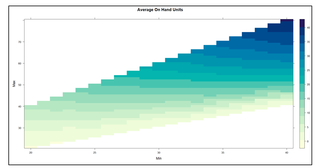
Figure 1 plots on hand inventory as a function of the values of Min and Max. The experiment yielded on hand levels ranging from near 0 to about 40 units.  In general, keeping Min constant and increasing Max results in more units on hand. The relationship with Min is more complex: keeping Max constant,  increasing Min first adds to inventory but at some point reduces it.

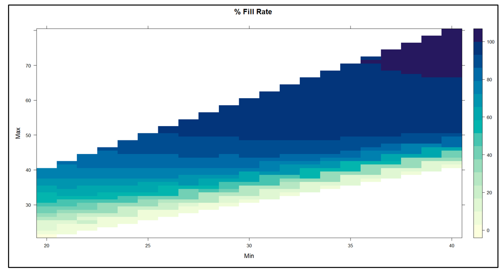
Figure 2 plots fill rate as a function of the values of Min and Max.  The experiment yielded fill rate levels ranging from near 0% to 100%.  In general, the functional relationships between the fill rate and the values of Min and Max mirrored those in Figure1.

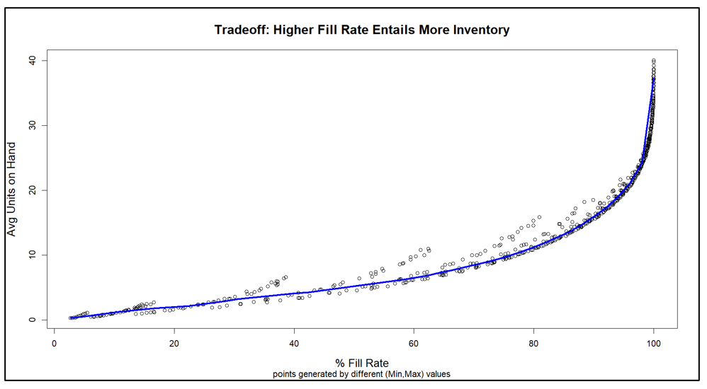
Figure 3 makes the key point, showing how varying Min and Max produces a perverse pairing of the key performance indicators. Generally speaking, the values of Min and Max that maximize item availability (fill rate)  are the same values that maximize inventory cost (average units on hand). This general pattern is represented by the blue curve. The experiments also produced some offshoots from the blue curve that are associated with poor choices of Min and Max, in the sense that other choices dominate them by producing the same fill rate with lower inventory.


Conclusions

Figure 3 makes clear that your choice of how to manage an inventory item forces you to trade off inventory cost and item availability. You can avoid some inefficient combinations of Min and Max values, but you cannot escape the tradeoff.

The good side of this reality is that you do not have to guess what will happen if you change your current values of Min and Max to something else. The software will tell you what that move will buy you and what it will cost you. You can take off your Guestimator hat and do your thing with confidence.

Figure 1 On Hand Inventory as a function of Min and Max values

Figure 1 On Hand Inventory as a function of Min and Max values


Figure 2 Fill Rate as a function of Min and Max values

Figure 2 Fill Rate as a function of Min and Max values


Figure 3 Tradeoff curve between Fill Rate and On Hand Inventory

Figure 3 Tradeoff curve between Fill Rate and On Hand Inventory


Direct to the Brain of the Boss – Inventory Analytics and Reporting

I’ll start with a confession: I’m an algorithm guy. My heart lives in the “engine room” of our software, where lightning-fast calculations zip back and forth across the AWS cloud, generating demand and supply scenarios used to guide important decisions about demand forecasting and inventory management.

But I recognize that the target of all that beautiful, furious calculation is the brain of the boss, the person responsible for making sure that customer demand is satisfied in the most efficient and profitable way. So, this blog is about Smart Operational Analytics (SOA), which creates reports for management. Or, as they are called in the military, sit-reps.

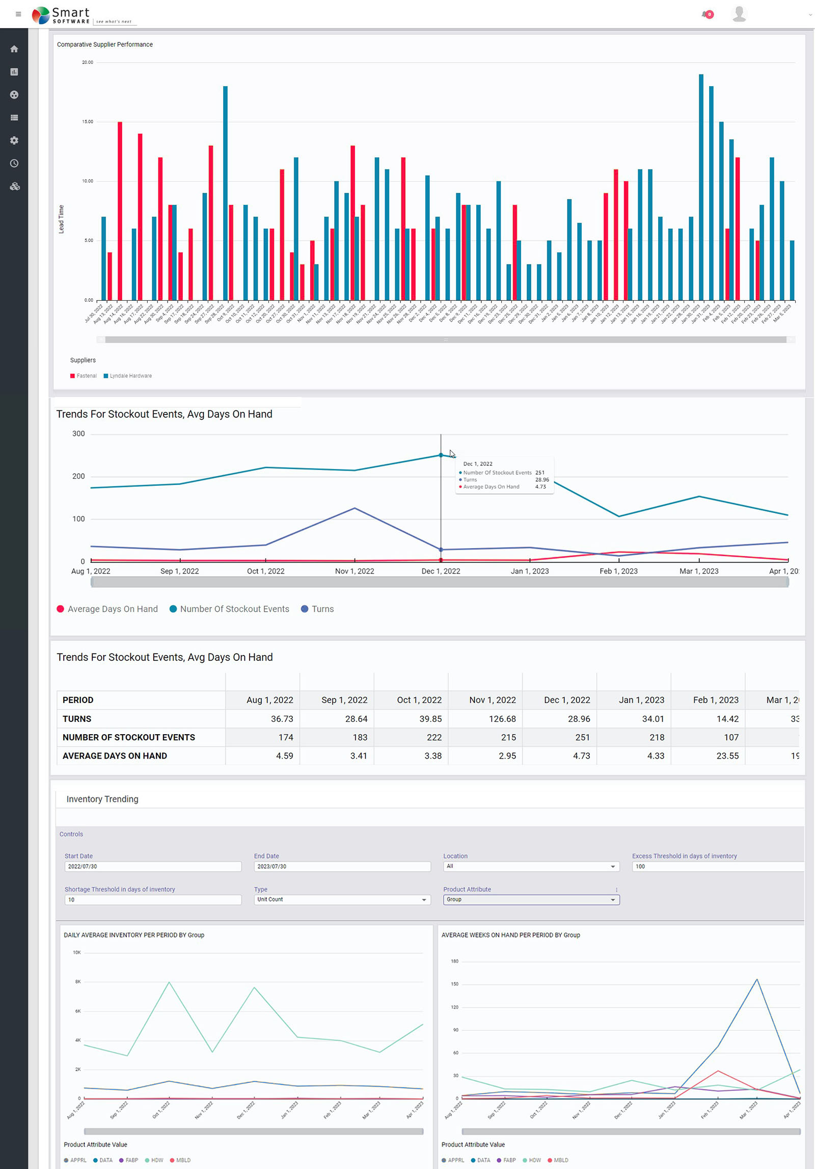
All the calculations guided by the planners using our software ultimately get distilled into the SOA reports for management. The reports focus on five areas: inventory analysis, inventory performance, inventory trending, supplier performance, and demand anomalies.

Inventory Analysis

These reports keep tabs on current inventory levels and identify areas that need improvement. The focus is on current inventory counts and their status (on hand, in transit, in quarantine), inventory turns, and excesses vs shortages.

Inventory Performance

These reports track Key Performance Indicators (KPIs) such as Fill Rates, Service Levels, and inventory Costs. The analytic calculations elsewhere in the software guide you toward achieving your KPI targets by calculating Key Performance Predictions (KPPs) based on recommended settings for, e.g., reorder points and order quantities. But sometimes surprises occur, or operating policies are not executed as recommended, so there will always be some slippage between KPPs and KPIs.

Inventory Trending

Knowing where things stand today is important, but seeing where things are trending is also valuable. These reports reveal trends in item demand, stockout events, average days on hand, average time to ship, and more.

Supplier Performance

Your company cannot perform at its best if your suppliers are dragging you down. These reports monitor supplier performance in terms of the accuracy and promptness of filling replenishment orders. Where you have multiple suppliers for the same item, they let you compare them.

Demand Anomalies

Your entire inventory system is demand driven, and all inventory control parameters are computed after modeling item demand. So if something odd is happening on the demand side, you must be vigilant and prepare to recalculate things like mins and maxes for items that are starting to act in odd ways.

Summary

The end point for all the massive calculations in our software is the dashboard showing management what’s going on, what’s next, and where to focus attention. Smart Inventory Analytics is the part of our software ecosystem aimed at your company’s C-Suite.

 Smart Reporting Studio Inventory Management Supply Software

Figure 1: Some sample reports in graphical form


Using Key Performance Predictions to Plan Stocking Policies

I can’t imagine being an inventory planner in spare parts, distribution, or manufacturing and having to create safety stock levels, reorder points, and order suggestions without using key performance predictions of service levels, fill rates, and inventory costs:

Using Key Performance Predictions to Plan Stocking Policies Iventory

Smart’s Inventory Optimization solution generates out-of-the-box key performance predictions that dynamically simulate how your current stocking policies will perform against possible future demands.  It reports on how often you’ll stock out, the size of the stockouts, the value of your inventory, holding costs, and more.  It lets you proactively identify problems before they occur so you can take corrective action in the short term. You can create what-if scenarios by setting targeted service levels and modifying lead times so you an see the predicted impact of these changes before committing to it.

For example,

  • You can see if a proposed move from the current service level of 90% to a targeted service level of 97% is financially advantageous
  • You can automatically identify if a different service level target is even more profitable to your business that the proposed target.
  • You can see exactly how much you’ll need to increase your reorder points to accommodate a longer lead time.


If you aren’t equipping planners with the right tools, they’ll be forced to set stocking policies, safety stock levels, and create demand forecasts in Excel or with outdated ERP functionality.   Not knowing how policies are predicted to perform will leave your company ill equipped to properly allocate inventory.  Contact us today to learn how we can help!