Are You Playing the Inventory Guessing Game?

Some companies invest in software to help them manage their inventory, whether it’s spare parts or finished goods. But a surprising number of others play the Inventory Guessing Game every day, trusting to an imagined “Golden Gut” or to plain luck to set their inventory control parameters. But what kind of results do you expect with that approach?

How good are you at intuiting the right values? This blog post challenges you to guess the best Min and Max values for a notional inventory item. We’ll show you its demand history, give you a few relevant facts, then you can pick Min and Max values and see how well they would work. Ready?

The Challenge

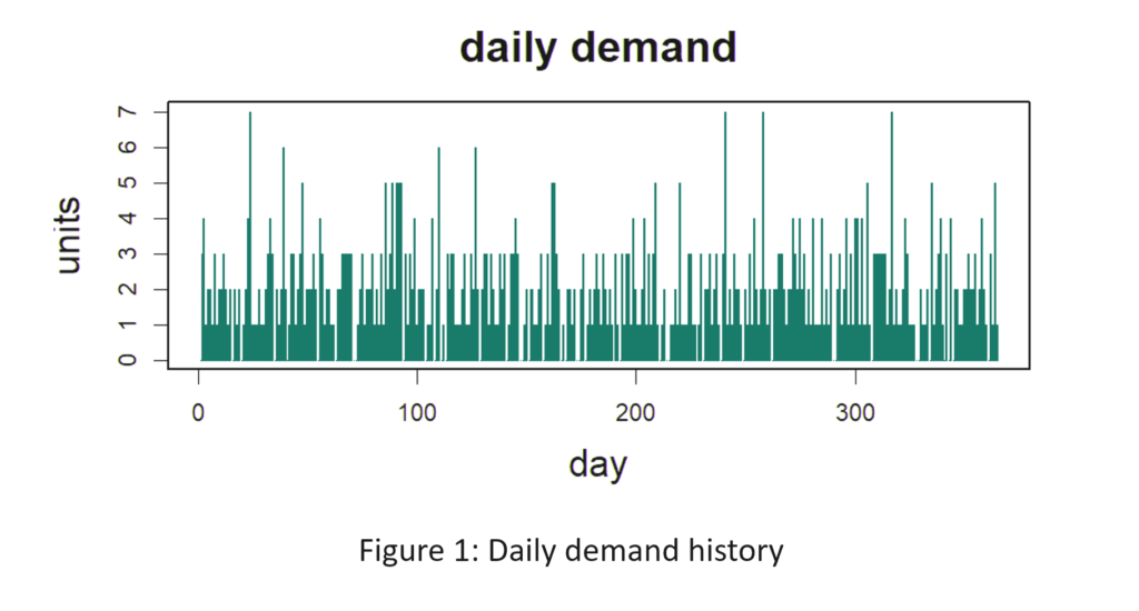
Figure 1 shows the daily demand history of the item. The average demand is 2 units per day. Replenishment lead time is a constant 10 days (which is unrealistic but works in your favor). Orders that cannot be filled immediately from stock cannot be backordered and are lost. You want to achieve at least an 80% fill rate, but not at any cost. You also want to minimize the average number of units on hand while still achieving at least an 80% fill rate. What Min and Max values would produce an 80% fill rate with the lowest average number of units on hand? [Record your answers for checking later. The solution appears below at the end of the article.]

Are You Playing the Inventory Guessing Game-1

Computing the Best Min and Max Values

The way to determine the best values is to use a digital twin, also known as a Monte Carlo simulation. The analysis creates a multitude of demand scenarios and passes them through the mathematical logic of the inventory control system to see what values will be taken on by key performance indicators (KPI’s).

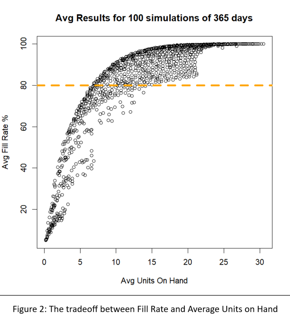
We built a digital twin for this problem and systematically exercised it with 1,085 pairs of Min and Max values. For each pair, we simulated 365 days of operation a total of 100 times. Then we averaged the results to assess the performance of the Min/Max pair in terms of two KPI’s: fill rate and average on hand inventory.

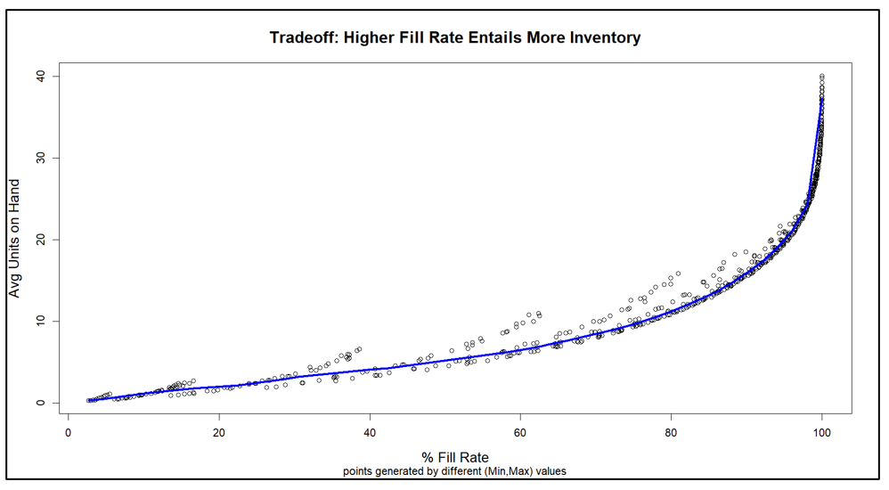
Figure 2 shows the results. The inherent tradeoff between inventory size and fill rate is clear in the figure: if you want a higher fill rate, you have to accept a larger inventory. However, at each level of inventory there is a range of fill rates, so the game is to find the Min/Max pair that yields the highest fill rate for any given size inventory.

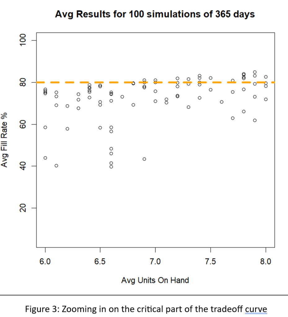
A different way to interpret Figure 2 is to focus on the dashed green line marking the target 80% fill rate. There are many Min/Max pairs that can hit near the 80% target, but they differ in inventory size from about 6 to about 8 units. Figure 3 zooms in on that region of Figure 2 to show  quite a number of Min/Max pairs that are competitive.

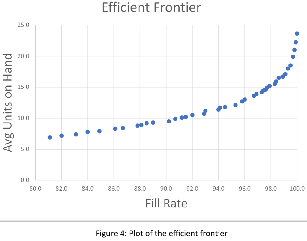
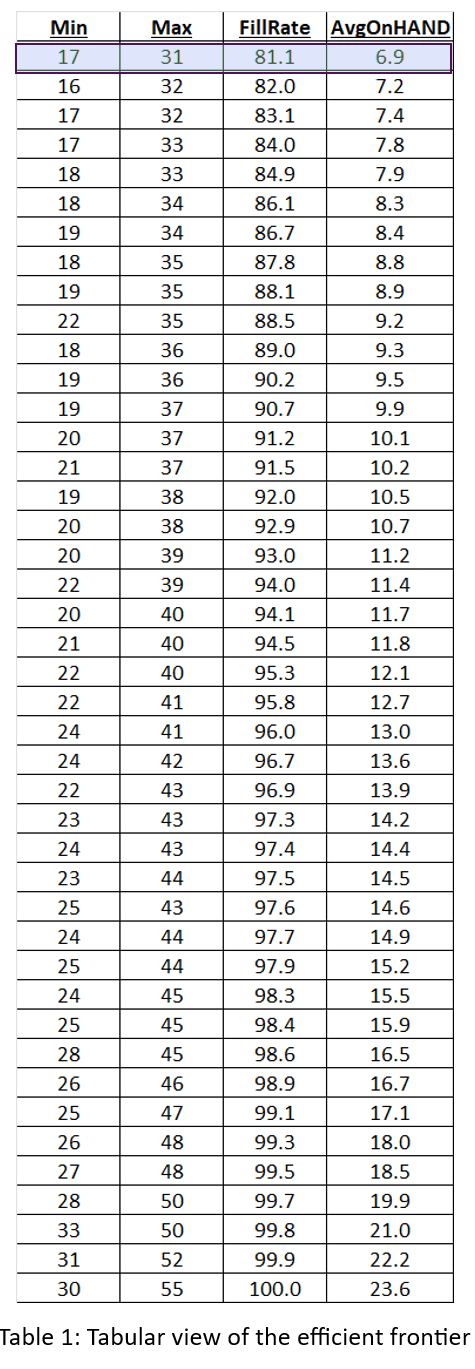
We sorted the results of all 1,085 simulations to identify what economists call the efficient frontier. The efficient frontier is the set of most efficient Min/Max pairs to exploit the tradeoff between fill rate and units on hand. That is, it is a list of Min/Max pairs that provide the least cost way to achieve any desired fill rate, not just 80%. Figure 4 shows the efficient frontier for this problem. Moving from left to right, you can read off the lowest price you would have to pay (as measured by average inventory size) to achieve any target fill rate. For example, to achieve a 90% fill rate, you would have to carry an average inventory of about 10 units.

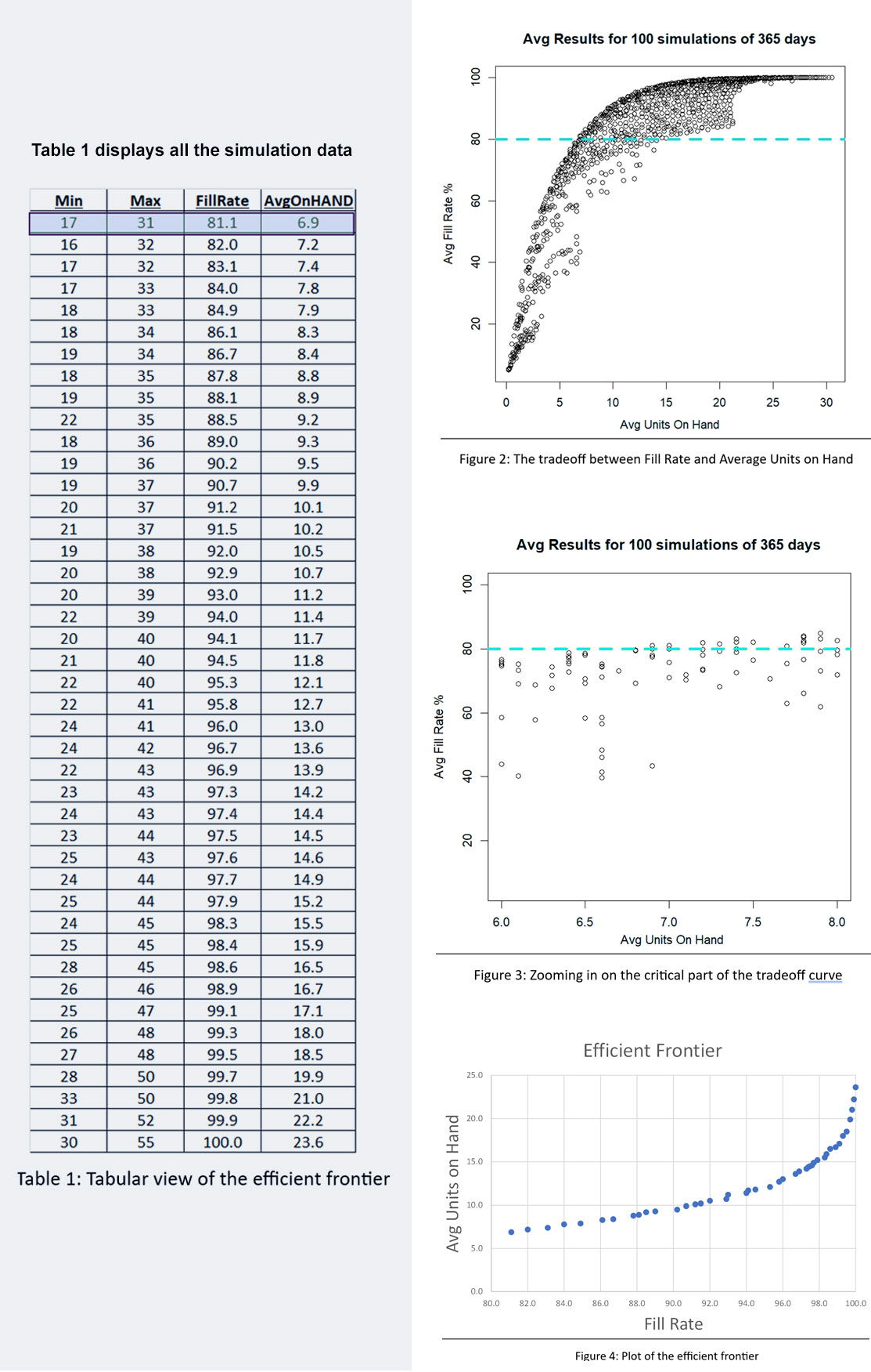
Figures 2, 3, and 4 show results for various Min/Max pairs but do not display the values of Min and Max behind each point. Table 1 displays all the simulation data: the values of Min, Max, average units on hand and fill rate. The answer to the guessing game is highlighted in the first line of the table: Min=7 and Max=131. Did you get the right answer, or something close2? Did you maybe get onto the efficient frontier?

Conclusions

Maybe you got lucky, or maybe you do indeed have a Golden Gut, but it’s more likely you didn’t get the right answer, and it’s even more likely you didn’t even try. Figuring out the right answer is extremely difficult without using the digital twin. Guessing is unprofessional.

One step up from guessing is “guess and see”, in which you implement your guess and then wait a while (months?) to see if you like the results. That tactic is at least “scientific”, but it is inefficient.

Now consider the effort to work out the best (Min,Max) pairs for thousands of items. At that scale, there is even less justification for playing the Inventory Guessing Game. The right answer is to play it… Smart3.

1 This answer has a bonus, in that it achieves a bit more than 80% fill rate at a lower average inventory size than the Min/Max combination that hit exactly 80%. In other words, (7,13) is on the efficient frontier.

2 Because these results come from a simulation instead of an exact mathematical equation, there is a certain margin of error associated with each estimated fill rate and inventory level. However, because the average results were based on 100 simulations each 365 days long, the margins of error are small. Across all experiments, the average standard errors in fill rate and mean inventory were, respectively, only 0.009% and 0.129 units.

3 In case you didn’t know this, one of the founders of Smart Software was … Charlie Smart.

Are You Playing the Inventory Guessing Game-111

Are You Playing the Inventory Guessing Game-Table 1


Finding Your Spot on the Tradeoff Curve

Balancing Act

Managing inventory, like managing anything, involves balancing competing priorities. Do you want a lean inventory? Yes! Do you want to be able to say “It’s in stock” when a customer wants to buy something? Yes!

But can you have it both ways? Only to a degree. If you lean into leaning your inventory too aggressively, you risk stockouts. If you stamp out stockouts, you create inventory bloat. You are forced to find a satisfactory balance between the two competing goals of lean inventory and high item availability.

Striking a Balance

How do you strike that balance? Too many inventory planners “guestimate” their way to some kind of answer. Or they work out a smart answer once and hope that it has a distant sell-by date and keep using it while they focus on other problems. Unfortunately, shifts in demand and/or changes in supplier performance and/or shifts in your own company’s priorities will obsolete old inventory plans and put you right back where you started.

It is inevitable that every plan has a shelf life and has to be updated. However, it is definitely not best practice to replace one guess with another. Instead, each planning cycle should exploit modern supply chain software to replace guesswork with fact-based analysis using probability math.

Know Thyself

The one thing that software cannot do is compute a best answer without knowing your priorities. How much do you prioritize lean inventory over item availability? Software will predict the levels of inventory and availability caused by any decisions you make about how to manage each item in your inventory, but only you can decide whether any given set of key performance indicators is consistent with what you want.

Knowing what you want in a general sense is easy: you want it all. But knowing what you prefer when comparing specific scenarios is more difficult. It helps to be able to see a range of realizable possibilities and mull over which seems best when they are laid out side by side.

See What’s Next

Supply chain software can give you a view of the tradeoff curve. You know in general that lean inventory and high item availability trade off against each other, but seeing item-specific tradeoff curves sharpens your focus.

Why is there a curve? Because you have choices about how to manage each item. For instance, if you check inventory status continuously, what values will you assign to the Min and Max values that govern when to order replenishments and how much to order. The tradeoff curve arises because choosing different Min and Max values leads to different levels of on hand inventory and different levels of item availability, e.g., as measured by fill rate.


A Scenario for Analysis

To illustrate these ideas, I used a digital twin  to estimate how various values of Min and Max would perform in a particular scenario. The scenario focused on a notional spare part with purely random demand having a moderately high level of intermittency (37% of days having zero demand). Replenishment lead times were a coin flip between 7 and 14 days. The Min and Max values were systematically varied: Min from 20 to 40 units, Max from Min+1 units to 2xMin units. Each (Min,Max) pair was simulated for 365 days of operation a total of 1,000 times, then the results averaged to estimate both the average number of on hand units and the fill rate, i.e., percentage of daily demands that were satisfied immediately from stock. If stock was not available, it was backordered.


Results

The experiment produced two types of results:

  • Plots showing the relationship between Min and Max values and two key performance indicators: Fill rate and average units on hand.
  • A tradeoff curve showing how the fill rate and units on hand trade off against each other.

Figure 1 plots on hand inventory as a function of the values of Min and Max. The experiment yielded on hand levels ranging from near 0 to about 40 units.  In general, keeping Min constant and increasing Max results in more units on hand. The relationship with Min is more complex: keeping Max constant,  increasing Min first adds to inventory but at some point reduces it.

Figure 2 plots fill rate as a function of the values of Min and Max.  The experiment yielded fill rate levels ranging from near 0% to 100%.  In general, the functional relationships between the fill rate and the values of Min and Max mirrored those in Figure1.

Figure 3 makes the key point, showing how varying Min and Max produces a perverse pairing of the key performance indicators. Generally speaking, the values of Min and Max that maximize item availability (fill rate)  are the same values that maximize inventory cost (average units on hand). This general pattern is represented by the blue curve. The experiments also produced some offshoots from the blue curve that are associated with poor choices of Min and Max, in the sense that other choices dominate them by producing the same fill rate with lower inventory.


Conclusions

Figure 3 makes clear that your choice of how to manage an inventory item forces you to trade off inventory cost and item availability. You can avoid some inefficient combinations of Min and Max values, but you cannot escape the tradeoff.

The good side of this reality is that you do not have to guess what will happen if you change your current values of Min and Max to something else. The software will tell you what that move will buy you and what it will cost you. You can take off your Guestimator hat and do your thing with confidence.

Figure 1 On Hand Inventory as a function of Min and Max values

Figure 1 On Hand Inventory as a function of Min and Max values


Figure 2 Fill Rate as a function of Min and Max values

Figure 2 Fill Rate as a function of Min and Max values


Figure 3 Tradeoff curve between Fill Rate and On Hand Inventory

Figure 3 Tradeoff curve between Fill Rate and On Hand Inventory


You Need to Team up with the Algorithms

Over forty years ago, Smart Software consisted of three friends working to start a company in a church basement. Today, our team has expanded to operate from multiple locations across Massachusetts, New Hampshire and Texas, with team members in England, Spain, Armenia and India. Like many of you in your jobs,  we have found ways to make distributed teams work for us and for you.

This note is about a different kind of teamwork: the collaboration between you and our software that happens at your fingertips. I often write about the software itself and what goes on “under the hood”. This time, my subject is how you should best team up with the software.

Our software suite, Smart Inventory Planning and Optimization (Smart IP&O™) is capable of massively detailed calculations of future demand and the inventory control parameters (e.g., reorder points and order quantities) that would most effectively manage that demand. But your input is required to make the most of all that power. You need to team up with the algorithms.

That interaction can take several forms. You can start by simply assessing how you are doing now. The report writing functions in Smart IP&O (Smart Operational Analytics™) can collate and analyze all your transactional data to measure your Key Performance Indicators (KPIs), both financial (e.g., inventory investment) and operational (e.g., fill rates).

The next step might be to use SIO (Smart Inventory Optimization™), the inventory analytics within SIP&O, to play “what-if” games with the software. For example, you might ask “What if we reduced the order quantity on item 1234 from 50 to 40?” The software grinds the numbers to let you know how that would play out, then you react. This can be useful, but what if you have 50,000 items to consider? You would want to do what-if games for a few critical items, but not all of them.

The real power comes with using the automatic optimization capability in SIO. Here you can team with the algorithms at scale. Using your business judgement, you can create “groups”, i.e., collections of items that share some critical features. For example, you might create a group for “critical spare parts for electric utility customers” consisting of 1,200 parts. Then again calling on your business judgement, you could specify what item availability standard should apply to all the items in that group (e.g., “at least 95% chance of not stocking out in a year”). Now the software can take over and automatically work out the best reorder points and order quantities for every one of those items to achieve your required item availability at the lowest possible total cost. And that, dear reader, is powerful teamwork.


Rethinking forecast accuracy: A shift from accuracy to error metrics

Measuring the accuracy of forecasts is an undeniably important part of the demand planning process. This forecasting scorecard could be built based on one of two contrasting viewpoints for computing metrics. The error viewpoint asks, “how far was the forecast from the actual?” The accuracy viewpoint asks, “how close was the forecast to the actual?” Both are valid, but error metrics provide more information.

Accuracy is represented as a percentage between zero and 100, while error percentages start at zero but have no upper limit. Reports of MAPE (mean absolute percent error) or other error metrics can be titled “forecast accuracy” reports, which blurs the distinction.  So, you may want to know how to convert from the error viewpoint to the accuracy viewpoint that your company espouses.  This blog describes how with some examples.

Accuracy metrics are computed such that when the actual equals the forecast then the accuracy is 100% and when the forecast is either double or half of the actual, then accuracy is 0%. Reports that compare the forecast to the actual often include the following:

  • The Actual
  • The Forecast
  • Unit Error = Forecast – Actual
  • Absolute Error = Absolute Value of Unit Error
  • Absolute % Error = Abs Error / Actual, as a %
  • Accuracy % = 100% – Absolute % Error

Look at a couple examples that illustrate the difference in the approaches. Say the Actual = 8 and the forecast is 10.

Unit Error is 10 – 8 = 2

Absolute % Error = 2 / 8, as a % = 0.25 * 100 = 25%

Accuracy = 100% – 25% = 75%.

Now let’s say the actual is 8 and the forecast is 24.

Unit Error is 24– 8 = 16

Absolute % Error = 16 / 8 as a % = 2 * 100 = 200%

Accuracy = 100% – 200% = negative is set to 0%.

In the first example, accuracy measurements provide the same information as error measurements since the forecast and actual are already relatively close. But when the error is more than double the actual, accuracy measurements bottom out at zero. It does correctly indicate the forecast was not at all accurate. But the second example is more accurate than a third, where the actual is 8 and the forecast is 200. That’s a distinction a 0 to 100% range of accuracy doesn’t register. In this final example:

Unit Error is 200 – 8 = 192

Absolute % Error = 192 / 8, as a % = 24 * 100 = 2,400%

Accuracy = 100% – 2,400% = negative is set to 0%.

Error metrics continue to provide information on how far the forecast is from the actual and arguably better represent forecast accuracy.

We encourage adopting the error viewpoint. You simply hope for a small error percentage to indicate the forecast was not far from the actual, instead of hoping for a large accuracy percentage to indicate the forecast was close to the actual.  This shift in mindset offers the same insights while eliminating distortions.


How Are We Doing? KPI’s and KPP’s

Dealing with the day-to-day of inventory management can keep you busy. There’s the usual rhythm of ordering, receiving, forecasting and planning, and moving things around in the warehouse. Then there are the frenetic times – shortages, expedites, last-minute calls to find new suppliers.

All this activity works against taking a moment to see how you’re doing. But you know you have to get your head up now and then to see where you’re heading. For that, your inventory software should show you metrics – and not just one, but a full set of metrics or KPI’s – Key Performance Indicators.

Multiple Metrics

Depending on your role in your organization, different metrics will have different salience. If you are on the finance side of the house, inventory investment may be top of mind: how much cash is tied up in inventory? If you’re on the sales side, item availability may be top of mind: what’s the chance that I can say “yes” to an order? If you’re responsible for replenishment, how many PO’s will your people have to cut in the next quarter?

Availability Metrics

Let’s circle back to item availability. How do you put a number on that? The two most used availability metrics are “service level” and “fill rate.” What’s the difference? It’s the difference between saying “We had an earthquake yesterday” and saying, “We had an earthquake yesterday, and it was a 6.4 on the Richter scale.” Service level records the frequency of stockouts no matter their size; fill rate reflects their severity. The two can seem to point in opposite directions, which causes some confusion. You can have a good service level, say 90%, but have an embarrassing fill rate, say 50%. Or vice versa. What makes them different is the distribution of demand sizes. For instance, if the distribution is very skewed, so most demands are small but some are huge, you might get the 90%/50% split mentioned above. If your focus is on how often you have to backorder, service level is more relevant. If your worry is how big an overnight expedite can get, the fill rate is more relevant.

One Graph to Rule them All

A graph of on-hand inventory can provide the basis for calculating multiple KPI’s. Consider Figure 1, which plots on-hand each day for a year. This plot has information needed to calculate multiple metrics: inventory investment, service level, fill rate, reorder rate and other metrics.

Key performace indicators and paramenters for inventory management

Inventory investment: The average height of the graph when above zero, when multiplied by unit cost of the inventory item, gives quarterly dollar value.

Service level: The fraction of inventory cycles that end above zero is the service level. Inventory cycles are marked by the up movements occasioned by the arrival of replenishment orders.

Fill rate: The amount by which inventory drops below zero and how long it stays there combine to determine fill rate.

In this case, the average number of units on hand was 10.74, the service level was 54%, and the fill rate was 91%.


KPI’s and KPP’s

In the over forty years since we founded Smart Software, I have never seen a customer produce a plot like Figure 1.  Those who are further along in their development do produce and pay attention to reports listing their KPI’s in tabular form, but they don’t look at such a graph. Nevertheless, that graph has value for developing insight into the random rhythms of inventory as it rises and falls.

Where it is especially useful is prospectively. Given market volatility, key variables like supplier lead times, average demand, and demand variability all shift over time. This implies that key control parameters like reorder points and order quantities must adjust to these shifts. For instance, if a supplier says they’ll have to increase their average lead time by 2 days, this will impact your metrics negatively, and you may need to increase your reorder point to compensate. But increase it by how much?

Here is where modern inventory software comes in. It will let you propose an adjustment and then see how things will play out. Plots like Figure 1 let you see and get a feel for the new regime. And the plots can be analyzed to compute KPP’s – Key Performance Predictions.

KPP’s help take the guesswork out of adjustments. You can simulate what will happen to your KPI’s if you change them in response to changes in your operating environment – and how bad things will get if you make no changes.